The Patriot
-
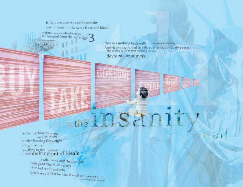
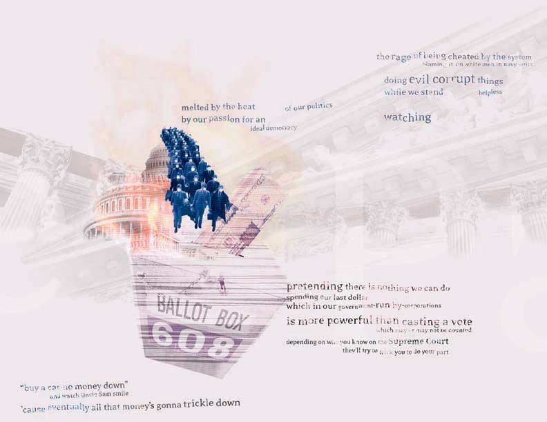
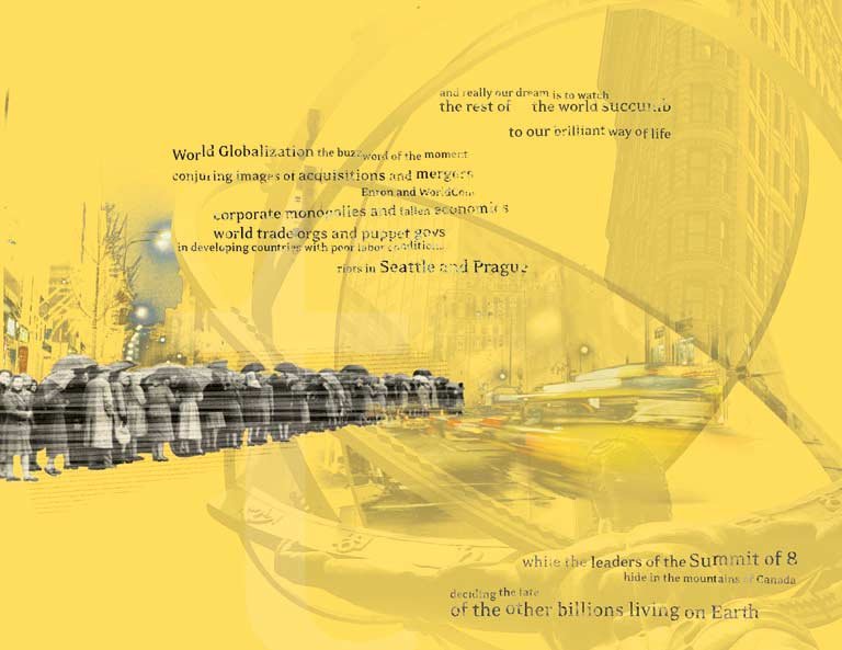
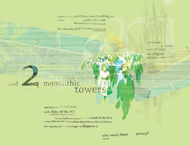
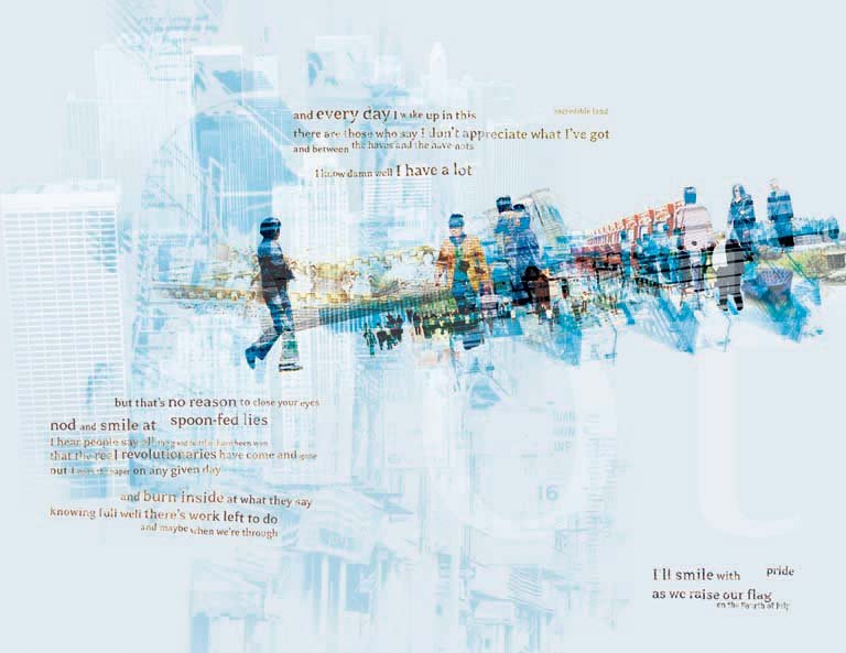
"The Patriot" series presents a striking exploration of digital design that blends typography, imagery, and conceptual depth. The work is based on a poem which I used to build visual hierarchy, negative space, and the interplay between form and content.
A bold, sans-serif typeface dominates the compositions, creating a strong visual anchor. The typographic treatments exhibit a sense of balance and proportion, with the text often fragmented or layered to create dynamic visual rhythms.
This deconstructive approach to typography echoes David Carson's work, yet maintains a clarity and purpose that speaks to contemporary design sensibilities.
The images, distorted or partially obscured, create a sense of tension and ambiguity that complements the textual content. This technique of image manipulation recalls the work of experimental designers like Neville Brody, pushing the boundaries between legibility and abstraction.
